From the moment I started photography, I’ve always gravitated towards softer, dreamy photos that leaned towards a more film-like appearance. Even my professor in college noticed my softer aesthetic.
While I didn’t intentionally continue to follow this style, I found it’s what I resonated with and decided to hone as I continued my photographic journey.
These days I use Lightroom to edit all of my images. I love Lightroom because it’s so simple to use and gives me the freedom to edit my images how I like.
Lightroom has a few tools that I’ve particularly found to help me achieve my dreamy, softer images consistently.
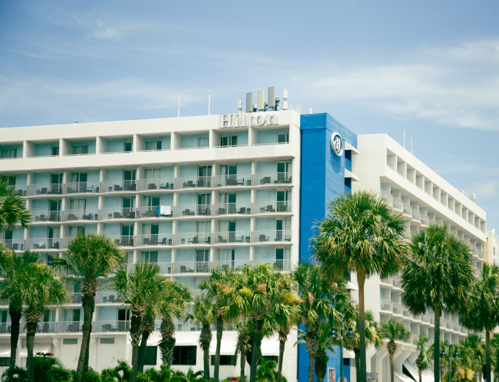
If you’re interested in creating softer images that still retain sharpness or you just want your digital photos to look like film, keep reading to see how these 3 tools in Lighroom helps me achieve images like the one below.

My Affordable, Beginner-Friendly Photography Starter Kit
Heads up! Some of the links on this page are Amazon affiliate links. That means if you click and make a purchase, I may earn a small commission—at no extra cost to you. It helps support the content I create (and my coffee habit ), so thank you! I only recommend things I genuinely love or think you’ll find useful.
_________________________________________________________________________________________________________
Before we ge started, I want to point out that dreamy photos and creating photos that look like film aren’t exactly the same, though they are related. I tend to do a combination of both to create a distinct look.
With that said, I’ll be providing tips on how to use these 3 easy tools to achieve both concepts, but these tips can be combined to make your images more interesting.
Achieve a Dreamy Photo Aesthetic With Curve Tool
If I had to choose only one tool to create my soft images, it would be the curve tool. I think this tool is underated when it comes to this but it’s my personal favorite.
I know that other tools like the dehaze slider and clarity slider work well, but I feel like the curve tool gives me more creative control.
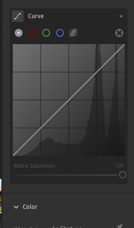
In particular, it gives you fine control over contrast, color, and brightness by adjusting the tonal range of an image, which is exactly what I need to achieve dreamy and film-like images.
Tips When Using Curve Tool to Create a Film-Like Aesthetic
Fade the Blacks for a Matte-Effect
Lift the left end of the RGB curve (shadows). This reduces true black, giving shadows a soft, faded appearance.
Reduce Highlights Slightly
Pull down the right end of the curve (highlights). This avoids overly bright whites, creating a flatter, vintage-like highlight roll-off.
Add Subtle Color Tints
Use Red, Green, or Blue curves individually. Add warmth in highlights (lift red or lower blue) and cool shadows (lift blue or lower red) for that cinematic color grade. I only occassionally play with color tints, but this is because I spend most of my time color grading and using the color mixer.
Adjust Midtones for a Soft Glow
Slightly lift the middle of the curve to brighten midtones. This gives a soft focus effect that you often see in dreamy film.
To Create a More Dreamy Aesthetic
Lower Overall Contrast Slightly
Use a gentle S-curve, but don’t push it too far. This keeps the image soft and light.
Lift Shadows and Midtones
This reduces harsh transitions and increases the light, ethereal vibe. For a dreamy pink or lavender look, trying lifting the red or blue channels in the shadow or highlights.
Transform Your Images With Color Grading
Color grading in Lightroom is a key part of transforming a basic photo into one with a dreamy or film-like aesthetic. While the Curves control the tonal contrast, Color Grading adds emotional tone and visual character by adjusting the hues and saturation in specific tonal ranges (shadows, midtones, highlights).
Here’s how color grading helps achieve those looks:
For Film-Like Looks
Tone the Shadows & Highlights
Classic film looks often involve cool shadows and warm highlights. For shadows, consider adding blue, teal, or green hues. For highlights, try orange, yellow, or warm pink.
This creates color contrast similar to analog film stock, where different areas naturally shift color based on exposure and chemical response.
Desaturate Midtones or Global Color
If you look at old film cinema, you’ll notice that the colors are usually muted. To achieve this, you can lower global saturation or reduce the intensity of the midtone color grading to get a more “washed out but rich” aesthetic.
Balance Warm & Cool
The balance slider in the Color Grading tool is a hidden gem. It offers an effective way to balance warm and cool tones in your image. Drage the slider toward highlights for a warmer feel. Drag the slider towards shadows for a cooler, moody tone.
For Dreamy Looks
Use Pastel Tones
Use soft, low-saturation hues like peach, rose, lavender, or soft teal. Avoid overly strong reds, greens, or blues as they can make your images harsh instead of soft and ethereal.
Warm Highlights & Cool Shadows
Add a soft warm tint to highlights (i.e peach or pale orange). If you want to enhance mood without contrast, add a slight cool blue or purple.
Additional tip: Lift Exposure and Lower Contrast
While not directly in the color grading panel, these adjustments work in harmony. A brighter, flatter image pairs well with soft color grading for that airy, dreamy effect.
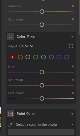
Adjust Brightness With Luminance
In Lightroom, Luminance (you can find this in manual noise reduction section and color mixer) controls the brightness of specific color ranges. It’s a tool that I actually stumbled on that surprisingly plays a powerful role in creating dreamy or film-like images.
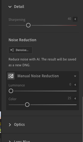
What is Luminance in Lightroom?
Luminance adjusts how light or dark a specific color appears without changing its hue or saturation. It’s especially useful for fine-tuning skies, foliage, and overall mood.
How Luminance Helps Achieve a Film-Like Look
Flatten Strong Colors
Slightly decrease luminance of colors (like blue or green) to add subtle contrast and tonal depth. This mimicks old film stock that handled color unevenly.
Add Mood with Selective Darkening
Darken blue or aqua luminance to make skies deeper and more cinematic. This brings attention to subjects and creates a classic “film drama”.
How Luminance Helps Create a Dreamy Look
Soften the sky
Luminance does a great job in softening the sky in my images. You can increase blue luminance to brighten the sky and reduce contrast. This can help make your image feel more whimsical and light and prevent the image from looking too moody
Lift Greens for Pastel Tones
You can increase green luminance to make foliage appear less harsh or saturated. Lifting greens also paires well with low contrast and soft highlights, creating a dreamy nature aesthetic.
Additional Tip: Use Luminance with Clarity & Color Grading
- Combine high luminance in warm tones, reduced clarity, and color grading to get soft, glowing skin and a pastel dreamlike look.
- For film, use selective luminance adjustments, faded blacks, and warm/cool split toning to match the color roll-off of real film.
I love using simple Lightroom tools and seeing how far I can go with it. Currently, I’m focused on refining my soft-aesthetic so I’ll definitely be exploring more Lightroom tools to see how far I can go with it and sharing it with you all.
If you use Lightroom, what’s been your favorite tool(s) to use? Also, if you liked this article, don’t forget to check out my previous article: The Number One Thing You Need to be a Successful Travel Photographer